July 1, 2011
Gmail Redesign: It's Light and Simple but looks good
Do you like this story?
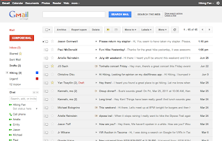
If you’re feeling daring, Google is offering users the chance to take the new, redesigned Gmail for a test drive ahead of its full-on rollout. And the first thing many people are going to notice: the new e-mail interface has a lot in common with Google+ (Google Plus).
Google’s “New Look” overview website, which is going to be detailing the cosmetic changes hitting the search giant’s services over the next little while, has the full instructions for how to activate the “Preview” and “Preview (Dense)” themes. But essentially, you just activate one or the other under the “Themes” tab in Gmail’s Settings and off you go.
So why two Preview themes? Well, Google says in its blog entry that eventually, the new-look Gmail will automatically adjust how much information is packed onto the screen based on the display resolution and other factors. But for now, it’s a manual switch. Moreover, you can switch between old Gmail and the new design at will until Google is ready for the full rollout, at which point it will become the default.
Overall, the new Gmail design looks very polished, with that same overall minimalist, appealing design that’s drawn praise from early users of Google+. The caveat, for now, is that some Google Labs features may not display quite correctly in this early version, but fixes are promised, along with updated versions of some of the other Gmail themes.
On a final note, the promised Google Calendar updates are apparently close enough to ready that users will start to see that redesign, with similar design principles, go live over the next couple of days, so keep an eye out.
 About the Author:
Ifeanyi Emeka is the founder of this blog and also writes for Tech Forked. He is passionate about tech stuffs and loves customizing blogger themes.
About the Author:
Ifeanyi Emeka is the founder of this blog and also writes for Tech Forked. He is passionate about tech stuffs and loves customizing blogger themes.Popular This Week
Gmail Redesign: It's Light and Simple but looks good
2011-07-01T19:09:00+01:00
dfgdfg
Gmail|Google|Google Redesign|Tech News|
Subscribe to:
Post Comments (Atom)


